
There is a special kind of alchemy to a great movie poster. It has to flirt, pitch, and promise, all while you are walking past it with a pretzel in one hand and your phone in the other. In marketing meetings, this is often called “the glance test.” On the street, we call it love at first sight.
The best entertainment marketing agencies treat posters like tiny stage productions: casting (imagery), blocking (composition), and a lead performance that can be read from across the lobby (typography). Below are seven design rules working pros lean on again and again, with the why behind each choice and the quick ways to spot it in the wild.
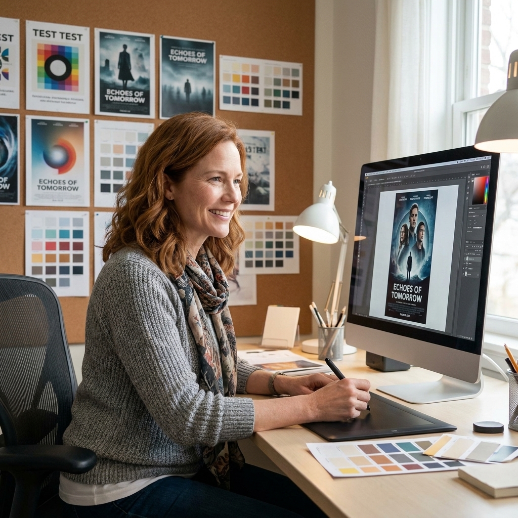
1) Build a hierarchy you can read fast
A poster is not a brochure. The viewer should understand the film’s title, tone, and one compelling hook in seconds. That clarity comes from hierarchy: which element speaks first, second, and third.
What pros do
- One dominant focal point: title, face, or iconic object, but rarely all three competing at the same volume.
- Clean reading path: your eye should travel naturally, often top to bottom or along a diagonal.
- Credit blocks stay obedient: required billing sits low and quiet, supporting the composition instead of wrestling it.
When a poster feels “expensive,” it is often because the hierarchy is calm. Even maximalist posters have a pecking order.
Real-world constraint: hierarchy is not just aesthetic, it is contractual. Billing order, studio legal lines, festival laurels, and talent placement are frequently non-negotiable. Great designers plan the composition around those requirements instead of treating them like an afterthought.
2) Let typography do acting
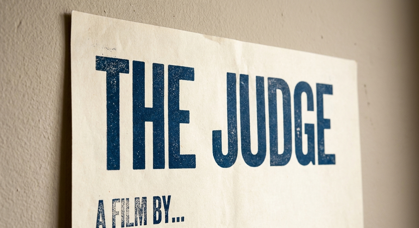
Typography is a performer. It can whisper indie intimacy, belt blockbuster confidence, or creep up your spine like a horror score. Industry teams obsess over type because it is one of the fastest ways to communicate genre without a single plot point.
Practical rules designers follow
- Limit type families: usually one primary face plus one supporting family, then vary weight and size for range.
- Protect legibility: if the title cannot be read as a thumbnail, it will not survive streaming grids.
- Pair contrast with intent: a refined serif against a raw photo can signal prestige drama, while a geometric sans can read as sleek sci-fi or contemporary thriller.
One simple tell: if you cover the image and only look at the title treatment, you should still get a strong hint of the movie’s vibe.
Think of the title like an actor’s entrance. You should know the energy immediately.
3) Choose a color story
Color is mood lighting. Before you process a face or a tagline, your brain reads temperature and contrast. Pros start by defining a palette that supports the film’s emotional promise, then they police it ruthlessly through every version, from teaser to international one-sheet.
How color theory shows up
- Complementary tension: blue versus orange is popular because it creates instant separation and cinematic punch, but it can look generic if overused.
- Limited palettes for identity: two or three dominant hues often feel more iconic than a rainbow of “everything.”
- Value contrast: light and dark separation is what keeps faces, titles, and key objects readable.
One of the smartest tricks is restraint. A single accent color, used sparingly, can become a signature you remember longer than a tagline.
4) Compose like a director
Poster composition borrows heavily from cinematography. Marketing teams talk about “shot selection,” “negative space,” and “depth cues” for a reason. A poster that feels like a film still is rarely accidental. It is staged to guide attention and communicate stakes.
Composition moves that work
- Rule of thirds, used flexibly: place the key face or object off-center for energy, then balance with title placement.
- Negative space as a headline tool: empty areas are not wasted, they are where titles breathe.
- Depth and layering: foreground, midground, background create scale and genre cues, especially in action, fantasy, and epic dramas.
5) Sell one idea
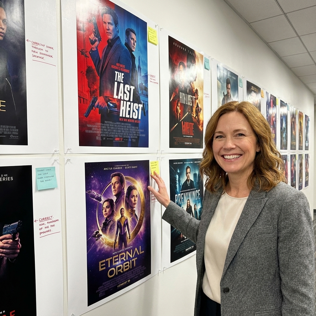
This is the hardest note for filmmakers to hear and the easiest for audiences to feel. A poster is not supposed to summarize. It is supposed to spark curiosity and set expectations. Pros look for a single emotional thesis: terror, romance, wonder, rebellion, grief, joy.
What “one idea” can be
- An iconic object: a symbol that becomes shorthand for the film. Think: one unsettling toy, one blood-red flower, one impossible artifact.
- A relationship: two characters positioned in a way that tells you everything about power and desire.
- A question: an image that feels unresolved, inviting you to lean in.
If you find yourself adding a second tagline, a third character, and a background montage, it is often a sign the core idea is not clear yet.
6) Make it work as a thumbnail
Movie posters used to live in lobbies and on city walls. They still do, but now they also live on phones, in streaming carousels, and in tiny recommendation tiles where detail evaporates. This is why agencies design for multiple “reads.”
The multi-size checklist
- Thumbnail read: title legible, central image recognizable, contrast strong.
- Mid-size read: star names, release window, and key mood elements become clear.
- Full-size read: textures, hidden symbols, and fine credits reward closer looking.
One pro habit I love: designers will physically step back from a print proof, or squint at a phone mock, to make sure the poster still speaks when it is basically a postage stamp.
7) Treat every element like brand
The best posters feel inevitable. That “of course it looks like that” sensation comes from branding choices that are consistent and intentional: type, palette, texture, and imagery that match the film’s world.
Brand consistency in poster design
- Texture and grain: clean polish for glossy spectacle, rougher treatments for grit or nostalgia.
- Icon systems: a recurring symbol that can travel across teasers, trailers, social, and merch.
- Series cohesion: for franchises, each installment needs freshness while still reading as part of the same family.
Photo vs illustration: photography can sell immediacy and star power fast. Illustration can build a world, simplify a complex concept into a single symbol, or sidestep the “floating heads” trap entirely. Either works, as long as the idea stays clear and the brand stays consistent.
A poster succeeds when it is not just beautiful, but useful: instantly recognizable, easily adaptable, and emotionally honest about what the movie is.
30-second poster critique
- Shrink test: could you identify the film at thumbnail size?
- Genre test: without reading names, do you know what kind of experience you are buying?
- Focus test: can you point to the one thing the poster wants you to feel?
- Typography test: does the title feel like it belongs to the image, or is it pasted on?

FAQ
What size is a standard movie poster?
In the U.S., the classic “one-sheet” is typically 27 x 40 inches for display. You may also see variations in production and trimming (and different standards by market, like the UK quad), which is why agencies build flexible design systems.
Why do so many posters look similar lately?
Because they are optimized for the same challenges: fast readability, tiny screens, and clear genre signaling. The posters that break through usually do it with a bolder single idea, stronger negative space, or a more distinctive type and color identity.
Is a minimalist poster always better?
Not always. Minimalism works when the film has a symbol or a tone strong enough to carry the message. Ensemble comedies and effects-driven epics sometimes need a fuller composition. The rule is not minimal, the rule is clarity.