If you have ever left a theater with your brain buzzing, not from plot twists but from light, you know the particular power of a visually ravishing documentary. The best ones do not just show reality. They compose it, shaping color, texture, movement, and rhythm until the world feels freshly designed.
Below are 10 documentaries that double as creative fuel. Each entry highlights what makes it gorgeous, how the visuals do narrative work, and one practical takeaway you can bring into your own film, photo series, or design project.
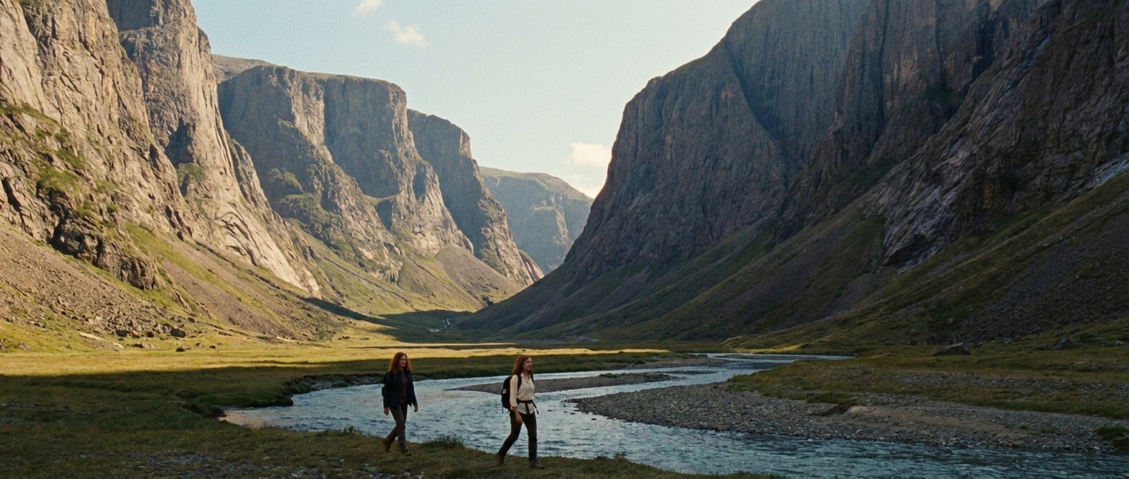
1) Baraka (1992)
Some documentaries explain the world. Baraka lets the world explain itself through pure image and rhythm. Captured in large-format 65mm and presented in 70mm, and assembled like a global mixtape of rituals, landscapes, and human patterns, it is the kind of film that makes you sit up straighter in your seat, like your eyes suddenly have a better job.
Why it is visually stunning
- Large-format clarity: The photography gives faces, fabrics, and landscapes a tactile sharpness that feels almost architectural.
- Time-lapse as commentary: Cities become living circuitry, suggesting modern life without a single spoken sentence.
- Graphic composition: Frames often read like carefully balanced posters, using symmetry and repetition to create meaning.
Creative takeaway: Try building a short piece with no dialogue and let pacing, contrast, and match cuts be your narration.
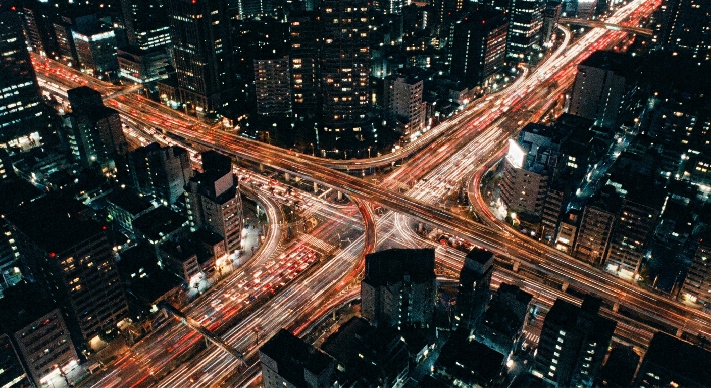
2) Samsara (2011)
If Baraka is a poem, Samsara is the sequel that leans even harder into visual philosophy. Like its predecessor, it was captured in large-format 65mm and presented in 70mm. It moves across sacred spaces, industrial systems, and intimate portraits with a hypnotic steadiness. The imagery is so deliberate that you start to feel the edit points like breaths. (Worth noting: this is largely non-verbal and essayistic, so go in expecting sensation and structure more than exposition.)
What to watch for
- Color grading with intention: Saturation shifts become emotional temperature changes, not just “pretty.”
- Controlled camera movement: Slow pushes and locked-off frames give the viewer time to read details.
- Visual contrasts: The film pairs beauty and brutality without sensationalizing, letting the juxtaposition do the talking.
Creative takeaway: Create a two-column mood board of “opposites” for your project, then plan visual pairings in your edit to make a point without spelling it out.
3) Koyaanisqatsi (1982)
This is the original “city symphony as existential question mark.” Koyaanisqatsi is famously light on conventional documentary information and heavy on visual structure, using time-lapse, slow motion, and monumental framing to turn modern life and industrial landscapes, largely American but not exclusively, into choreography. Also, expect more visual essay than narrated facts.
Why it still hits
- Monumental scale: Skyscrapers, highways, and crowds are shot like they are geological forces.
- Rhythmic editing: Visual repetition becomes its own kind of narrative, as if the film is finding the beat of modern life.
- Texture-forward imagery: Industrial surfaces, smoke, and concrete become a palette.
Creative takeaway: Before you shoot, decide your “visual meter.” Are you cutting like jazz, like a lullaby, or like a machine? Let that answer shape shot length and movement.
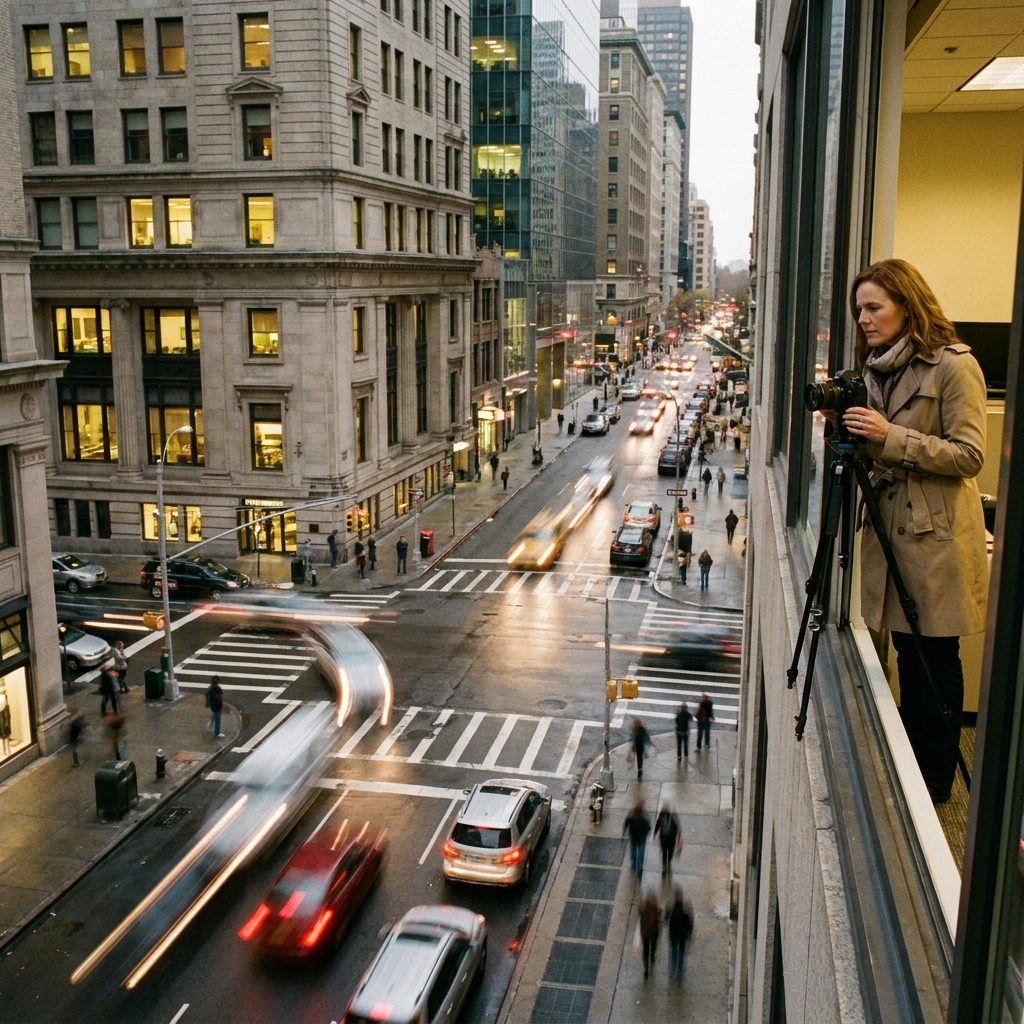
4) Honeyland (2019)
Honeyland is proof that observational filmmaking can look as composed as a period drama without ever feeling staged. Set in a rural corner of North Macedonia, it follows a wild beekeeper with a filmmaker’s patience and a painter’s eye for golden light.
Visual storytelling techniques
- Natural light mastery: Soft dusk and interior candlelight create a warm, lived-in palette.
- Intimate framing: Close-ups of hands, honeycomb, and weathered faces build tenderness and tension.
- Landscape as mood: Wide shots are not just scenic, they underline isolation and resilience.
Creative takeaway: If you are shooting people, build a “light diary.” Note what time of day makes your subject feel most themselves, then schedule around that instead of fighting it.
5) The Salt of the Earth (2014)
Part biography, part visual retrospective, this film about photographer Sebastião Salgado is a gorgeous study in how still images can be made cinematic. The documentary uses clever framing devices, archival travel footage, and a deep respect for photographic contrast to put you inside the emotional weight of Salgado’s work.
Why it works
- Black-and-white tonality: The film honors Salgado’s signature contrast, letting shadows carry feeling.
- Layered image presentation: Photographs are revealed with pacing that mimics looking, not consuming.
- Ethical gaze: It invites reflection on what it means to witness and to frame suffering.
Creative takeaway: Treat stills like scenes. Give them entrances, pauses, and exits in your edit so the audience has time to absorb.
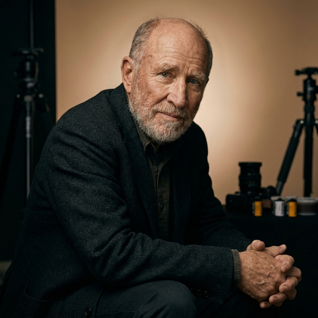
6) The Truffle Hunters (2020)
This film feels like walking into a storybook that smells faintly of damp earth and good pasta. Following elderly truffle hunters in Italy, it turns forests into cathedrals and kitchens into tiny theaters, with a camera that lingers like it is in love with the world.
Signature visual choices
- Classical composition: Many shots are framed with old-world balance, like still lifes with pulse.
- Night scenes with delicacy: Darkness is not a void. It is full of texture and anticipation.
- Warm interior palette: Candlelight and tungsten tones make domestic spaces glow.
Creative takeaway: Use negative space intentionally. A quiet corner of frame can make a character’s small gesture feel monumental.
7) Fire of Love (2022)
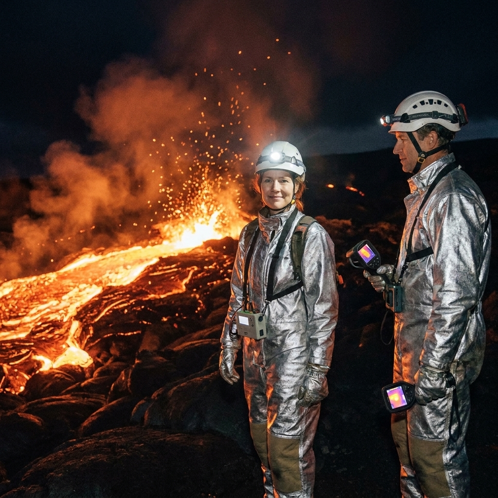
Archive documentaries live or die by curation. Fire of Love, built from the volcanic footage of Katia and Maurice Krafft, does something rare: it makes archival material feel freshly authored. The images are jaw-dropping and, at times, terrifying, all lit by the otherworldly glow of lava.
How the visuals carry the story
- Color as danger and allure: Reds and oranges are not just spectacle, they are a romantic obsession made visible.
- Texture and scale: Ash clouds, rock, and smoke create a tactile sense of risk.
- Editorial restraint: The film trusts the footage, using rhythm and selection rather than visual over-processing.
Creative takeaway: When working with archive, establish a “house rule” for color and grain. Consistency makes disparate footage feel like one film, not a scrapbook.
8) Planet Earth II (2016)
Yes, it is a series, but it belongs on any list of visual inspiration because it is basically a graduate course in camera innovation. Planet Earth II pairs jaw-dropping wildlife moments with compositions that make animals feel like protagonists in an epic narrative. It also showcases a very real toolkit of modern nature cinematography, including stabilized aerial shots, remote camera rigs, and intimate long-lens work that keeps distance without losing emotion.
Cinematography highlights
- Precision lenses and distance: Intimacy without intrusion, letting behavior unfold naturally.
- Slow motion with purpose: Movement becomes readable, emotional, and suspenseful.
- Color grading that respects nature: Vivid but not plastic, with careful attention to greens, blues, and skin tones in varied light.
Creative takeaway: Build “behavioral coverage.” Instead of only grabbing pretty wides, plan for establishing, detail, and reaction shots so your subject’s actions become story beats.
9) Free Solo (2018)
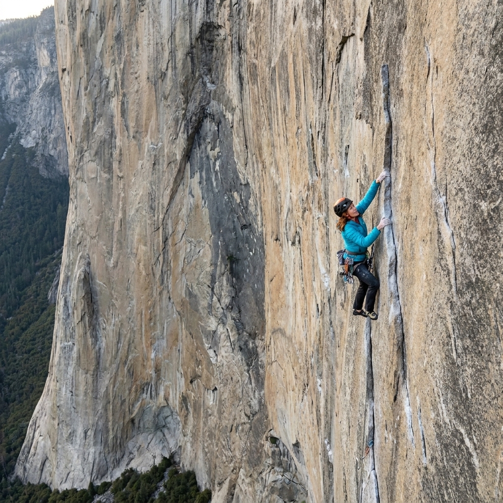
Rock climbing documentaries can lean on adrenaline. Free Solo adds a clean, almost minimalist visual discipline that makes the danger feel even sharper. El Capitan becomes a vertical stage, and the camera’s job is to honor both the scale and the terrifying specificity of each handhold.
What makes it sing
- Spatial clarity: You always understand where you are on the wall, which keeps suspense honest.
- Skin tone and stone tone balance: Color is managed so that climber and cliff remain distinct even in harsh daylight.
- Editorial perspective shifts: Alternating intimate ground-level moments with vast aerials creates emotional whiplash in the best way.
Creative takeaway: When filming stakes, make sure your visuals communicate consequence. Scale, distance, and silence can do what dialogue cannot.
10) Summer of Soul (2021)
Concert docs can be visually chaotic. Summer of Soul is visually exuberant but never messy, restoring and presenting 1969 Harlem Cultural Festival footage with a sense of celebration and care. The camera loves the performers, and the edit understands that the audience is part of the picture.
Visual storytelling techniques
- Restored color and texture: The film keeps the period feel while letting skin tones and stage lighting glow.
- Performance coverage as portraiture: Close-ups land like photographs, catching micro-expressions that make music feel personal.
- Cutting that honors rhythm: The edit rides the music, but it also knows when to hold a face and let a note land.
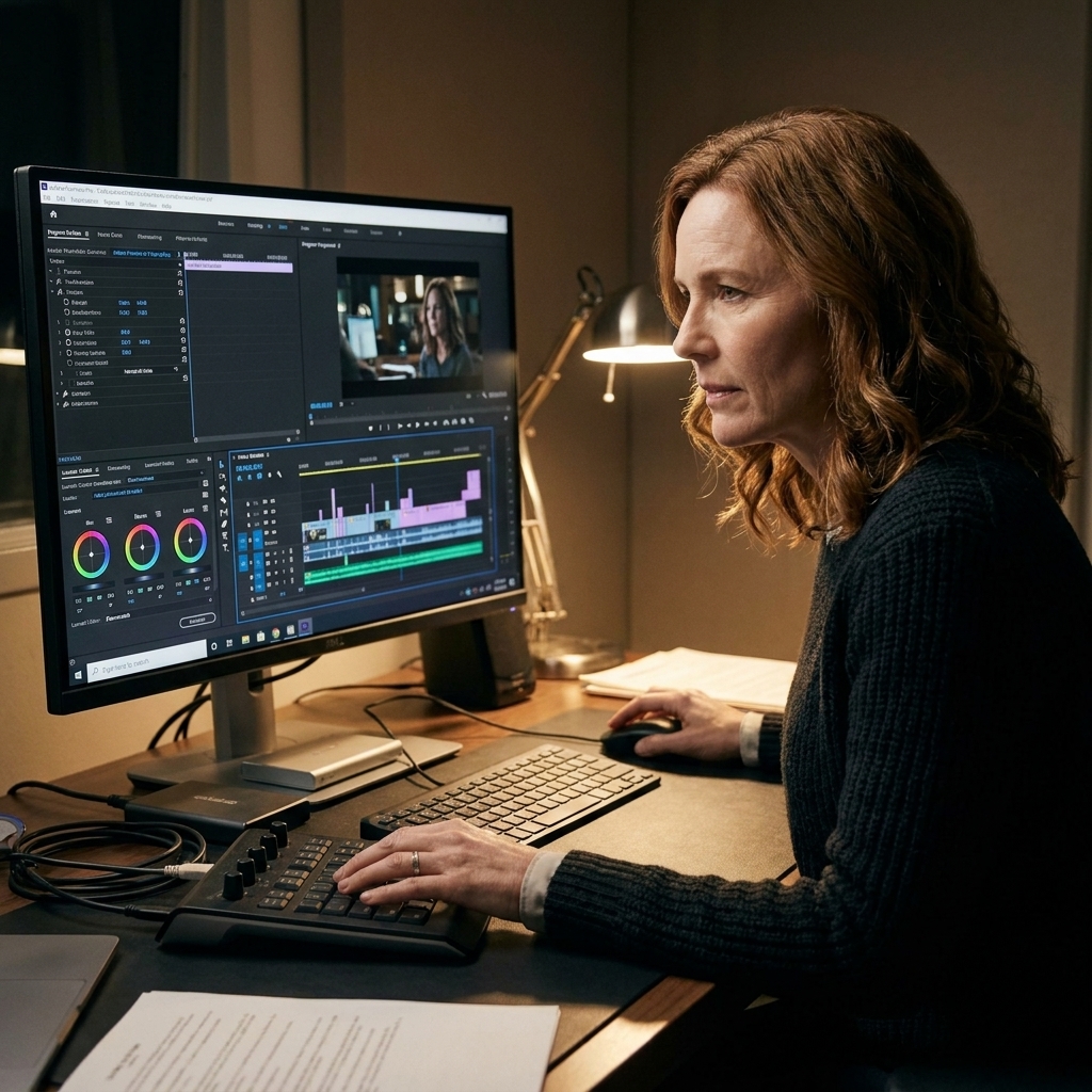
Creative takeaway: If you are cutting to music, map your edit in “breaths,” not just beats. Sometimes the best cut is the one you delay.
Steal the techniques
I am firmly pro-inspiration and firmly anti-copying. The good news is that most of what makes these documentaries unforgettable is not a single shot. It is a system of choices you can adapt to your own scale and budget.
- Choose a palette: Decide your dominant tones and one accent color. Let wardrobe, locations, and grading reinforce it.
- Design your distance: Close, medium, far. Use distance to communicate intimacy, power, or isolation.
- Let reality be stylized: Composition, blocking, and light can be intentional even when nothing is staged.
- Edit like a writer: Build motifs, echoes, and visual punchlines. Repetition is not redundancy, it is theme.
Quick picks
- If you want nature as high art: Planet Earth II, Honeyland
- If you want bold visual essays: Koyaanisqatsi, Samsara, Baraka
- If you want archive that feels alive: Fire of Love, Summer of Soul
- If you want tension you can feel in your palms: Free Solo
- If you want photography translated to cinema: The Salt of the Earth
One last note
When you watch these, stay through the credits. Not for trivia, for gratitude. Documentaries are built by crews who wait for the right light, carry gear into impossible places, and spend months shaping footage into meaning. If you are about to start your own creative project, that devotion is as inspiring as any sunrise time-lapse.